Wednesday, April 25, 2012
Monday, April 23, 2012
Simon Kavanagh

Simon Kavanagh is a graphic artist with a broad, international education. He studied at the National College of Art and Design in Ireland, receiving a joint degree in teaching a visual communications. After graduating college, he spent two years studying and developing his artistic identity in Paris. Following this span of time, Simon then moved to Shanghai to teach Chinese students for three years. Now, he is back in Europe. His broad range of experiences and education has left him the a diverse collection of works.
The work that had caught my eye on Rhizome was the Paris night Blur series. Abstract paintings and pictures have always interested me, and Kavanagh had created this piece without a digital aid. That is a concept which I had found interesting as so much of our discussion in class revolves around how artwork is now digitally manipulated and even something which looks natural has no doubt been altered. This photograph was not altered after, the distortion of the image taking place in the present as the photograph was snapped. We often use cameras to try and capture what is in front of us, to preserve a moment or a memory. The concept of trying to capture such a distorted image proves interesting to me.
Traveling is one of my passions, although I haven't quite the money to indulge it at this point. Recently, in class, we discussed how one uses a camera while on travel to try and preserve a memory or instance. Often times, they want to show others, but it means more to them than anyone else. A picture is more than just an image, but representative of an experience or feeling to the person who took it. At least, that is the way I look at pictures. Simon Kavanagh has lived in many places and has captured them on film in a way that goes along with this mindset.
They are all slightly distorted or abstract in some way, shape, or form. We may look at them one way, but I don't doubt that they hold a certain meaning for him that we may not be able to extract ourselves. He invites the viewer to guess where the pictures had been taken. They are all random and, I think, quite realistic to how photographs turn out when one is on travel, trying to capture whatever random moment they can, to preserve it for later. This is one of my favorites. Its composure is interesting artistically, the foreground some sort of lattice, clean and crisp (even somewhat dainty), while the background is in ruin. Nobody would be able to decipher where the picture is from without an explanation. It just comments on how pictures are just part of a story, and do not function as the whole story in themselves.
Wednesday, March 28, 2012

Monday, March 5, 2012


Logo Redesign: Oral-B

I chose to redesign the Oral-B logo. They make toothbrushes and to me, you can't exactly tell that from the logo. The logo doesn't really represent anything. It's just a representation of text. So, I decided to keep with the general feel of the text and colors as it looked clean to me. I put the text inside of a mouth that I drew with the pen tool. The blue inside of the mouth was done with the brush.
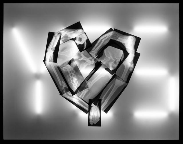
James Clar: For You, Anything
James Clar is a media artist, who creates diverse work using light. His work often incorporates a social message, taking cues from popular culture. His early works just examined the interplay and functioning of technology and media. Clar moved to the Middle East in 2007, this move inspiring a change in the concept of his work. His art evolved from a use of technology and media so that each work could portray an overall concept. These concepts include views on society, popular culture, and the world. It also explores the differences between Western and Middle Eastern media.
 The work above is called "For You, Anything". When first looking at the display, the first thing that jumps out at me in the shape of a heart in the foreground. One can see that it is composed of a series of x-rays. These x-rays are, of course, of broken bones. In the background, I note that the light illuminating the x-rays is in the shape of the word "YES". This word is capitalized, which also holds significance. This display is trying to convey the message that love is limitless. One is capable of loving another person so much so (YES) that they would do anything for them, even if it includes broken bones.
After looking at this for a moment, I thought of another meaning for this display that wasn't the artist's original intention. It could, perhaps, be a comment on violence in relationships. Many women who end up in abusive relationships stay in them. The word "YES" could represent this. The heart represents love but a twisted form of love that is represented by the broken bones and injuries that may occur in a seriously physically abusive relationship.
Overall, I think the image is very intriguing. The fact that it is only in black and white is interesting, because he could have used a different color for the light tubes, such as red for a heart. However, I don't think color in this piece is necessary or even desired. The black and white brings out the shapes and the figures clearly. It is taking an emotion, love, that is so complex and turning it into something very black and white with color. Love is abstract and this image, with its use of color is concrete. It portrays a message when paired with the title of the image, but leaves itself open to a bit more interpretation if one does not view the title. For instance, the use of bones for the heart could also assert that love is an emotion that goes beyond ones heart and seeps into ones bones. Love is part of our very framework as human beings. I think it's a wonderful piece.
Sunday, March 4, 2012

Wednesday, February 29, 2012

Monday, February 27, 2012

Wednesday, February 22, 2012
5 Self Portraits
 |
| Portrait 1: YUMMmm, Satisfied Julie |
 |
| Portrait 2: Angry Julie |
 |
| Portrait 3: Really Excited Julie |
 |
| Portrait 4: Anxious Julie |
 |
| Portrait 5: Happy Julie |
Wednesday, February 15, 2012

Monday, February 6, 2012
Photo Edits


Hybrid Collage

This is my collage. I used for scans from other blogs to create it. (Alison Romano, Caiti Sullivan, Ellie Hammack)
Thursday, February 2, 2012
Splice
Matt Bomer of White Collar

Henry Cavill of The Tudors (He was in Immortals and is also the new Superman)
 Splice (Matt's hair, eyebrows, nose, and mustache scruff on Henry)


Henry Cavill of The Tudors (He was in Immortals and is also the new Superman)


Monday, January 30, 2012
Scanned Images (with edits)

TEDDY BEAR <3


HALF BUNNY FROM EASTER EGG HUNT


CHUCK E. CHEESE TICKET


EARRINGS


JEWELRY CONTAINER TOP


MAGNIFYING GLASS


MINERAL


TURTLE


Tuesday, January 24, 2012
Joseph Scheer: Moths - Enhancing Art
 |
| http://www.artnet.com/artists/joseph-scheer/artworks-for-sale |
Joseph Scheer is famous for his works in print and on the web. He has employed technology to enhance nature in how one views it and how one thinks of it. He is known for his prints of moths. He worked with a technical speciality, Klingensmith, who provided Scheer with the scanner responsible for capturing three-dimensional images of moths (National Geographic). The special scanner can take up to 20 minutes to scan a single moth, resulting in high pixel images and expansive data files.
In this prints, one is able to see moths at high resolution. Detail is visible that may not even be visible to the naked eye. His prints are blown up to over 30" large and sold. It truly is an enhancement of nature. Joseph spends a great deal of time perfecting each picture, keeping the actual moth in view as he edits the digital files of the moth. He does this so the picture is a fair representation of the actual moth (National Geographic).
When one thinks of a moth, one does not think "beauty". I think of insects that are on my door and fly into my house. Joseph captures the beauty of a moth, and the detail of its structure, in a way nobody had before him. What I admire most about the prints are that they are so realistic. With photoshop and other digital tools, it is quite simple to enhance an image to make it more vibrant and appealing, even if it is already appealing in the first place. For instance, the picture of the dragonfly on this page is attractive. The original was attractive and received many compliments (credit to Matthew Wise) but I enhanced it to look even more vibrant and sharp. Joseph does not enhance his moth pictures in the slightest. He works to preserve their natural form, enhancing them so that people can see and appreciate the moth better, but not striving to make it look falsely beautiful. With all the available options of enhancement in this day and age, I think it's commendable and the thing I appreciate most about his art.
Monday, January 23, 2012
Can Henne: E Paintings
"My passion is to raise awareness that there is much more than meets the eye. There is an incredible power within color and form, not only to entertain us, but to lift our emotions and moods, but there is this amazing ability to transfer information. In fact, that's what's going all the time. We may not even be aware of it, but that's what's happening." - Can Henne
Can is a diverse artist, responsible for creating digital works, paintings, installations, video art, and sculptures. He is also the director of the Pink Gallery in Berlin. For a number of years, Can has been experimenting with photography and painting. Originally, Can had intended this artwork to include photo cutouts and color. This artwork has evolved into what he calls his E Paintings. Can thinks of his computer monitor as a canvas, using the photo cutouts as he originally intended but using digital means to paint in the same piece of art. He also scans real paint into some of his E Paintings.
Each of the E Paintings is very abstract in nature. There are innumerable layers to each work, all with a different opacity so some aspects of the E Painting are obvious, where others have to be focused on for a long time in order to see what is truly there. Each E Painting is filled with vivid colors that draw the eyes, distinctive shapes standing out in each one. His E Painting, "Finally Arrived", viewable in section 11 was especially interesting to me just because this title is more ambiguous than the rest. It left me with the question of "Where have I arrived?", as it seems Can's E Paintings are meant to appeal in different ways to a variety of people.
The "Finally" in the title implies wherever one is arriving has been desired for some time. In the E Painting, one is able to view stars and moon, appealing to those with a scientific background. In the bottom left hand corner, I see a city and I think of the Emerald City in the Wizard of Oz. Just above the city, I see a faint image of Tree, which would appeal to those who believe in God or have a strong religious background. Perhaps the faintest image in the entire E Painting that I see is a house, the peak of it visible in the sky. This E Painting could be of finally arriving home, reaching success in another form, or dying. I believe the colors in "Finally Arrived" are meant to draw upon emotions, red and yellow being emphasized perhaps to evoke a sense of hope, joy, or love. Perhaps the mixture of the familiar and grounded and abstract and foreign is meant to draw upon a human beings mixed/contrasting feelings towards death, or finally arriving.
The ambiguous nature of his E Paintings is what I think truly makes them strong. All of them are strongly distorted in one way or another, allowing for anyone who views them to pick up on select parts of the E Painting of which to identify. His use of distinct colors and shapes, and how they intermingle, has the capability to leave the viewer with a certain emotion. One may not even be able to describe what she feels when viewing each E Paintings, but Can definitely achieves his goal (as cited in the first quote). The viewer is able to feel something towards each painting and cannot deny that there are multiple level to the experience which may not always be interpreted.
Subscribe to:
Comments (Atom)