Wednesday, April 25, 2012
Monday, April 23, 2012
Simon Kavanagh

Simon Kavanagh is a graphic artist with a broad, international education. He studied at the National College of Art and Design in Ireland, receiving a joint degree in teaching a visual communications. After graduating college, he spent two years studying and developing his artistic identity in Paris. Following this span of time, Simon then moved to Shanghai to teach Chinese students for three years. Now, he is back in Europe. His broad range of experiences and education has left him the a diverse collection of works.
The work that had caught my eye on Rhizome was the Paris night Blur series. Abstract paintings and pictures have always interested me, and Kavanagh had created this piece without a digital aid. That is a concept which I had found interesting as so much of our discussion in class revolves around how artwork is now digitally manipulated and even something which looks natural has no doubt been altered. This photograph was not altered after, the distortion of the image taking place in the present as the photograph was snapped. We often use cameras to try and capture what is in front of us, to preserve a moment or a memory. The concept of trying to capture such a distorted image proves interesting to me.
Traveling is one of my passions, although I haven't quite the money to indulge it at this point. Recently, in class, we discussed how one uses a camera while on travel to try and preserve a memory or instance. Often times, they want to show others, but it means more to them than anyone else. A picture is more than just an image, but representative of an experience or feeling to the person who took it. At least, that is the way I look at pictures. Simon Kavanagh has lived in many places and has captured them on film in a way that goes along with this mindset.
They are all slightly distorted or abstract in some way, shape, or form. We may look at them one way, but I don't doubt that they hold a certain meaning for him that we may not be able to extract ourselves. He invites the viewer to guess where the pictures had been taken. They are all random and, I think, quite realistic to how photographs turn out when one is on travel, trying to capture whatever random moment they can, to preserve it for later. This is one of my favorites. Its composure is interesting artistically, the foreground some sort of lattice, clean and crisp (even somewhat dainty), while the background is in ruin. Nobody would be able to decipher where the picture is from without an explanation. It just comments on how pictures are just part of a story, and do not function as the whole story in themselves.
Wednesday, March 28, 2012

Monday, March 5, 2012


Logo Redesign: Oral-B

I chose to redesign the Oral-B logo. They make toothbrushes and to me, you can't exactly tell that from the logo. The logo doesn't really represent anything. It's just a representation of text. So, I decided to keep with the general feel of the text and colors as it looked clean to me. I put the text inside of a mouth that I drew with the pen tool. The blue inside of the mouth was done with the brush.
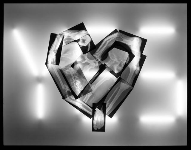
James Clar: For You, Anything
James Clar is a media artist, who creates diverse work using light. His work often incorporates a social message, taking cues from popular culture. His early works just examined the interplay and functioning of technology and media. Clar moved to the Middle East in 2007, this move inspiring a change in the concept of his work. His art evolved from a use of technology and media so that each work could portray an overall concept. These concepts include views on society, popular culture, and the world. It also explores the differences between Western and Middle Eastern media.
 The work above is called "For You, Anything". When first looking at the display, the first thing that jumps out at me in the shape of a heart in the foreground. One can see that it is composed of a series of x-rays. These x-rays are, of course, of broken bones. In the background, I note that the light illuminating the x-rays is in the shape of the word "YES". This word is capitalized, which also holds significance. This display is trying to convey the message that love is limitless. One is capable of loving another person so much so (YES) that they would do anything for them, even if it includes broken bones.
After looking at this for a moment, I thought of another meaning for this display that wasn't the artist's original intention. It could, perhaps, be a comment on violence in relationships. Many women who end up in abusive relationships stay in them. The word "YES" could represent this. The heart represents love but a twisted form of love that is represented by the broken bones and injuries that may occur in a seriously physically abusive relationship.
Overall, I think the image is very intriguing. The fact that it is only in black and white is interesting, because he could have used a different color for the light tubes, such as red for a heart. However, I don't think color in this piece is necessary or even desired. The black and white brings out the shapes and the figures clearly. It is taking an emotion, love, that is so complex and turning it into something very black and white with color. Love is abstract and this image, with its use of color is concrete. It portrays a message when paired with the title of the image, but leaves itself open to a bit more interpretation if one does not view the title. For instance, the use of bones for the heart could also assert that love is an emotion that goes beyond ones heart and seeps into ones bones. Love is part of our very framework as human beings. I think it's a wonderful piece.
Sunday, March 4, 2012

Subscribe to:
Comments (Atom)